Followers

Saturday, March 15, 2014

Birthday Boots

It has been a while since I made a card just for fun so today I thought I would indulge myself :)  I do love making a card to fit in with a few challenge, I find it really gives me focus and creates a challenge within itself to bring all the elements together.

This card has been made to fit the following challenges

  • Passion For Promarkers - Butterfly Kisses - add/use butterflies
  • I Love Promarkers - Lets Get Spotty
  • Chocolate, Coffee and Cards - Colour Inspiration
  • Freshly Brewed Designs - Sketch
To make my card I tried a new technique which I have seen others using - inking an embossing folder so you get a textured coloured paper.  What fun, I thoroughly enjoyed doing this and love the uneven effect I give, definitely a technique to use again, I just wish the embossing folder would clean itself afterwards hahahaha.  For this experiment I used an Encore Metallic Pink stamp pad and an A4 embossing folder M-Bossabilities Graduated Dots.  This folder was chosen to fit in with the I Love Promarkers challenge
 Yipee - it worked, still need a bit of practice but not bad for a first attempt.
 There was still ink left on the folder so I used my second colour of plain paper which fits in with the colour challenge and then used Spellbinders Grand Scallop Ovals to cut the shape I needed.
 Next I printed the digi - Gardening Boots Hers from Just Inklined.  I had placed the didi on a background I had prepared and added the Happy Birthday text.
 Promarker time - the digi was coloured using the colours below.
 To fit in with the Passion for Promarkers challenge I created digitally some paper which had small butterflies on using the colours from the Chocolate, Coffee and Cards challenge in a pattern  and also used spellbinder - les papillions two.  The base layer was cut out of bits left over from the backing paper I made and the cut out section from scraps of the oval layer.  Shame to waste bits and pieces especially when the colour was just perfect.  I finished off the butterfly and the corners of the digi topper with Lilac Liquid Pearls
With all by sections ready time to assemble following the sketch Freshly Brewed Designs. 
While assembling I felt something else was needed - to many harsh lines.  To solve this I added some Mulberry paper, airbrushed with Promarker Blue Green, then wet the edges and tore to make a fluffy edge. And here we have the finished card.  Hope you like it.

Ingredients
  • Digi - Gardening Boots Hers from Just Inklined
  • M-Bossabilities Graduated Dots embossing folder
  • Encore Metallic Pink stamp pad
  • Promarkers
  • Dies - Spellbinders Grand Scallop Ovals and Les Papillions Two
  • Lilac Liquid Pearls
  • Plain papers and mulberry paper from my stash
I am entering this card in the following challenges:-


Tuesday, March 11, 2014

Movie Night - Vaguely Goth

Time for another challenge over at

Movie Night

What - a Movie Night, now this is a challenge.  What can one do I wonder???  A poster for a new movie, an invite to friends for a movie night at home, a remake of an old movie, the options are endless.  After much though and chewing of pencils I decided to make a popcorn holder for the sequel of Avatar.  I loved Avatar, the colours and special effects had me totally drawn in.

To begin with I made a template of a popcorn holder which I cut on my Black Cat.  I then coloured this with Blue glitter acrylic paint and using Promarkers, air brushed black and maroon over the top.   Boy did I get messy hahahaha

 Next I printed my planning and working sheet with two copies of the digi, Vaguely Goth by IKEsART.  Also on my sheet are some popcorn pieces which I designed, to be cut out and coloured with Promarkers, blossom coloured oval which I need to decorate for the box, the front and back of a tag I am adding and a ticket to the movie which I designed.  Also on my sheet is my idea how to colour the digi which I played around with digitally the other night and a pic of Neytiri from the real movie for inspiration.
 If you saw the movie, do you remember the part in the forest where we see the Tree of Souls, (my favourite bit) and all the seeds etc are floating around?  That is the basis for the background of my popcorn box. I know my interpretation is nothing as beautiful as the real thing but it works for my box :) :) :) I added .................. in blue and silver to the base of the oval to represent the tendrils, air brushed with Midnight Blue and Maroon for a bit of shadow etc and then covered with Stickles applied with a paint brush..  I also drew other floating seeds with a silver pen directly onto the box.  The popcorn was fussy cut and areas coloured with Satin Promarker.  These were then attached to the box.

The digi was coloured with Promarkes.  Once again I forgot to take a photo of it before I fussy cut it and attached it to the box grrrrrrr.
 Next I fussy cut the sections for the tag on a stick.  Again I airbrushed to get some shadow going on. More silver and blue ....... was added, the skewer was stuck to the back of one side and then I put the back on.
 Finally I cut out the ticket which I designed.

Here is the finished pop corn container complete with popcorn :) :) :) 


side view

I am all set now, just need the movie to be written, produced and released for public viewing :) :) :)
IKEsWORLD Challenge - Movie Night.
Prize
To win the prize you must use and IKEsART image.
Ingredients:-
  • Vaguely Goth by IKEsART
  • ProMarkers - 
  • Blue and Silver
  • Blue Glitter acrylic paint
  • Stickles, skewer, silver pen etc. from my stash

I am entering this project into the following challenges:-

Sunday, March 9, 2014

Baby Gangstaz Zeke


Hello folks.  We have another challenge at One Stitch At A Time so how about popping over to see all the fabulous creations by the design team.

Challenge #203

Theme 'For a Boy'

Our sponsor this week is the StitchyBear Digital Outlet with a prize of $9 to spend in the store.  To win this prize you MUST use a digi from the StitchyBear Digital Outlet.  A second prize of $3 to spend in the StitchyBear Digital Outlet will be given to an entrant who does not use a SB product.

This week I have worked with the fun image Baby Gangstaz Zeke by Rheeces Scrap Pieces.  Here I am out of my box again - For a Boy - how could I use this digi.  I can't think of a single bloke in my family I could make something for with this digi, either they were too old or would only approve of Spiderman (am I right Jay <g).  Not stuck, if I add the word tom in front of boy that that could well apply to me so I think for once I will make something for myself.  Yes - an idea, I will make a door hanger for my craft room saying as I don't have any indication from the outside of the room as to what is happening behind the closed door.  While in the UK I had bought a packed of pre cut door hangers just in case they would come in handy for a project. I have to admit, it feels a bit like cheating as I usually cut my own items but hay ho never mind.


 Next I covered the pre cut door hanger with a shiny purply brown paper I have had for a while and cut the area where the hole is along with the slit at the top.
Now the fun starts, I really felt like being a mucky pup today so out came the acrylic paints - yummy :) :) :) 
 

I blobbed the paint onto the covered door hanger and then . . . . 

got my fingers really dirty with some finger smudging.  This was one occasion when I found it very hard to stop what I was doing but I had to or else it would have all become one colour hahahaha

While the background was drying I set to colouring the digi with Promarkers.  At some point I will remember to take a picture of the finished digi before I attach it to the project.  Here is a cropped image of the coloured digi.
 Finally I used white peel off stickers for the text (yes my craft room looks like an environmentally hazardous zone :) :) :) If I was brave enough I would take a photo of it to share with you, I could tidy it up before hand but then I wouldn't be able to find anything :)  The digi was attached with foam tape for added dimension.


And here it is hanging on my craft room door :)

Ingredient:-
  • Digi - Baby Gangstaz Zeke by Rheeces Scrap Pieces
  • Acrylic paints
  • Promarkers - Forest Green, Bright Green, Apple, Leaf Green, Grey Green, Capri Blue, Denim Blue, Pastel Blue, Cool Grey 3, 4, 5
  • Flex Markers - Nutmeg, Dusky Pink, Blush and Linen
I am entering this project in the following challenges:-


Sunday, March 2, 2014

Love Hand Doodle - OSAAT

Hello folks.  We have another challenge at One Stitch At A Time so how about popping over to see all the fabulous creations by the design team.

Challenge #202

Theme 'Anything Goes' 

The sponsor is StitchyBear Digital Outlet with a 7 image prize pack. To win main prize you MUST use an Image from our store. Runner up prize for person using none store image is $3 to spend in the StitchyBear Digital Outlet. So everyone can win something ;O).

For this weeks design I chose for our team to work with  'Love Hand Doodle' by GraftyGirl Creations.  I loved this digi when I first saw it and have longed to get a chance to work with it, just my cup of tea :)  I decided, with such a fabulous digi which has great depth of meaning to carry that theme through the card. The digi is the hand sign for love but my card is not a traditional 'I love you' card but one that speaks of love in many ways.  To start with the colours were important.  I chose dark red, teal and an olive green as they go rather well together visually and all have a meaning associated with love (I may be a little loose on my interpretation though).  Dark red, well red is the colour of love and passion so that is easy, teal is the colour of sentimentalism, and we all love a bit of that in our relationships I think.  Finally, green, the colour of love and hope.  I also used gold, gold is such a beautiful colour with each of the paper colours in this group and added just that bit of zing.  Gold signifies generosity, giving and compassion, all things that are so important in a loving relationship whether it be with a partner or  a special friend.

Next I used a saying 'Love, possible whether you are near or far for love lives in the heart'.  A lot of meaning for me there as my hubby worked overseas for many years while I raised our kids in the UK.  Now I am overseas with my hubby and our kids along with the rest of my family are in the UK.  Not all hearts in the same place at the same time.  What else to add, ah!! the word love in different languages which I printed on the dark red paper.  We have a few new teamies on our team and even some of the oldies are not from the UK or have English as their main language so this is for them and for all the other international crafters emerging on the scene in our blogland world :) :) :).


Next I coloured the digi with Promarkers :- Burgandy, Rock Pool and Olive Green finishing off with a gold Metallic Promarker.


I had created a cutting file to cut the shapes I needed but decided to try and use my Spellbinder Grand Scallop Ovals instead, using the negative cut out for the card not the inner shapes.  I then went over the black love in many languages text with gold pen.  Alas I did not like this last bit so reprinted and re-cut the dark red layer leaving the text black.


I assembled the card and then using the same Promarkers I used for the digi and the spray gun coloured the inside.  Three wee hearts were punched with some of the left over paper I had.

Now we have the completed card.  The finishing touches of mounting the digi on black and attaching to the card with foam tape for added dimension, a gold punched heart embossed with a heart embossing folder and also mounted on black and finally three buttons also coloured with the same Promarkers.  I can hear you asking what the buttons symbolise hahahaha. OK in my warped way of thinking the buttons are to symbolise a way of attaching two things together, in this case - two hearts in love.


Ingredients:-
  • White card from Craft Creations
  •  'Love Hand Doodle' by GraftyGirl Creationss available from the StitchyBear Digital Outlet
  • Red paper from a scrap pad, the teal and green are from magazines but I can't remember which - sorry
  • Promarkers - Metallic Gold, Burgundy, Rock Pool and Olive Green
  • Heart Punch
  • Heart embossing folder
  • Buttons and gold mirror card from my stash
I am entering this card into the following challenges:-
Thanks for looking and hope you have a happy crafting day:)

Wednesday, February 26, 2014

Unicorn Dreams

Another fun day, totally sidewinded from what I should have been doing (a couple of projects for upcoming DT post) and ended up making a tag for a tag swap and a card for my daughter.


To begin with I cut my card blank and covered it with a design paper I have had for years, I think it came in a multi surprise pack I bought about six years ago.  Next I took some woven stuff I had and cut it into three strips, trimmed the edges then overlaid this on top of the covered card blank with adhesive spray.

While this was drying I printed out the digi which I had placed on a brown background digitally and a heart shape with text which will become my topper.  The digi is UNICORN DREAMS �Karen Middleton, isn't it just fabulous, so full of movement.  I knew this digi was going to be a challenge, trying to keep all that movement alive but worth a shot.  My daughter loves horses and got her first horse a few months ago (after having waited 32 years lol) and this card is for her.
Out with my beloved Promarkers again.  Now I now one usually thinks of unicorns as white but I have decided to try to make a chestnut unicorn instead.  I felt like working in browns today hahahaha.
To finish off the digi I used clear embossing powder on the butterfly, leaves and wee flowers.
I wanted to add a charm to the card so found a silver heart I had and, with my gold Promarker, coloured it to match the card.  I also printed out a mount for the digi to be placed on with the text 'magical, fantasy, beauty is in the eye of the beholder'.  With my dreadful spelling I had to double check if beholder was correct and found out by fluke it was also the name of the horse that was the winner of the 2013 Breeders' Cup Distaff - how cool is that!!!! Next I cut some of the same paper I had used for the mount with the sentiment and covered it with brown lace to create another mount. I also had a bit of ribbon cut but forgot to put that in front of the camera when I snapped this pic.

Now time to assemble my card and here we have the finished creation :)

Followed this sketch from Sketch N Stash

Ingredients:-
  • White card from Craft Creations
  • Digi - UNICORN DREAMS by Karen Middleton, available from Sweet Pea Stamps
  • Promarkers
  • Lace, dp, mesh, buttons, clear embossing powder, charm and ribbon from my stash
I am entering this card in the following challenges:-

Tuesday, February 25, 2014

Lily of the Valley

Just a very quick post here as I seem to have been well sidetracked this evening <g>.  I won this fabulous digi Lily of the Valley by Rachel Anderson last week have have been longing for the opportunity to use it so this afternoon I gave myself some 'me time' to create a card with it.

First I created the graduated background and placed the digi on top.

When I planned the card I wanted to use green lace which I was sure I had in my stash.  Alas, after hunting and finding red, blue, purple, brown, black and white but no green I had to get creative.  Backup plan was to cover my white card blank with green embossed paper and then overlay white lace coloured with my precious Promarkers to get the effect I wanted <g>  The lace was then sprayed with adhesive spray and placed on the prepared card blank.

While this was drying I set to work on colouring the digi. As you can see, I seemed to have used a multitude of colours <g>
I finished of the digi with Lilac Liquid Pearls on the hair and wings and Ice Stickles for over the dew drops for a bit of shimmer. Next was to create some embellishments and a tag for the card.  I deliberately used a dark green card which would not be to noticeable against the background as I don't like cluttered cards but do like to see lots going on <g>  I used one of the snowflakes from Impression Obsession Snowflakes and embellished them with more Lilac Liquid Pearls.  The tag is from X-Cut tags.
 
Now to assemble my card.  I made the bow, and placed the snowflake dies where I wanted them.  Next I mounted the digi on dark green card and attached this to the card blank with foam tape for added dimension.  The tag was attached with foam tape too.  To finish off I place a small mauve purple heart gem in the centre of the bow.  Here we have the finished card.

Ingredients:-

  • Digi - Lily of the Valley by Rachel Anderson
  • Card from Craft Creations
  • Dies -Impression Obsession Snowflakes and X-Cut tags
  • Promarkers and Flexmarkers
  • Green embossed paper, lace, Liquid Pearls, Ice Stickles, Peel Off sticker from my stash.
I am entering this card in the following challenges:-

Tic Tac Toe - KatPhish

Time for another challenge over at

Tic Tac Toe

OOOOO exciting stuff, I love a Tic Tac Toe challenge, not just thinking how to use a digi in a creation but also to incorporate the other elements :) Here is the Tic Tac Toe grid which you need to follow to enter the IKE'sWORLD challenge this week.


The line I am following is:- Stitching Faux or Real, Lace and Brads

I was in IKEA the other day and had, what might be a bright idea or maybe not, but certainly worth a try.  A clock was on the agenda but it had to be one that the hands were not to close to the surface of the clock face so I could decorate it.  Brilliant, they had the perfect clock for what I wanted.  For the project I first removed the hands -


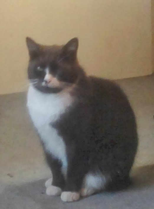
Don't you just love it when what might be a problem turns out to be easy peasy.  I needed to work within the inner circle of this clock and thankfully one of the Spellbinder Grand Circles was just the same size saving me a lot of messing about.   First I coloured the digi digitally to look like a particular cat I know as this clock is for a very special person (I know you will know who you are when you see this - just sorry it won't be a surprise <g>).  Here is a photo of Leo, the cat I used to guide me in the colouring.


It is not often I have my wee camera with me when creating, often not much point as I get so carried away I forget to take the pics.  Today I made a mega effort to show you the process of this creation.   I printed the text I wanted and placed the coloured digi on the white card and used the die to cut this circle,  an acetate circle and the lace circle. So here we are with the circles cut out, the lace one was also cut with the die (not easy but I used sellotape  all over one side to stop it moving and stretching in the die and it worked). I also cut a second copy of the coloured digi which I fussy cut and will be placed on top of the lace layer.


I arranged the layers temporarily as now was the time for any corrections if sizing etc. were wrong.


All looking good so next was to colour the fish.  I used Promarkes first then added some gold and silver guilding.  The next layer on was the acetate and to hold that in place I added some brads my sister had given me a while back which are pussy cat related.  They are not showing up very well but three are shaped like fish showing their bones, another says 'treats' and the last one says 'furry friends'.  

The topper was trimmed and attached to the centre of the clock with double sided tape.  Using my black Promarker I created Faux stitching in the groove just beyond the inner circle.  Once everything was completed I put the hands back and here we have the finished clock :) :) :)


Ingredients:-
  • Digi - KatPhish available from IKEsART
  • Clock from IKEA
  • Promarkers
  • Lace, brads and acetate from my stash
I am entering this project into the following challenges:-